Project _ 01
Oriel needed a calm, confident identity that could hold its own next to louder competitors.
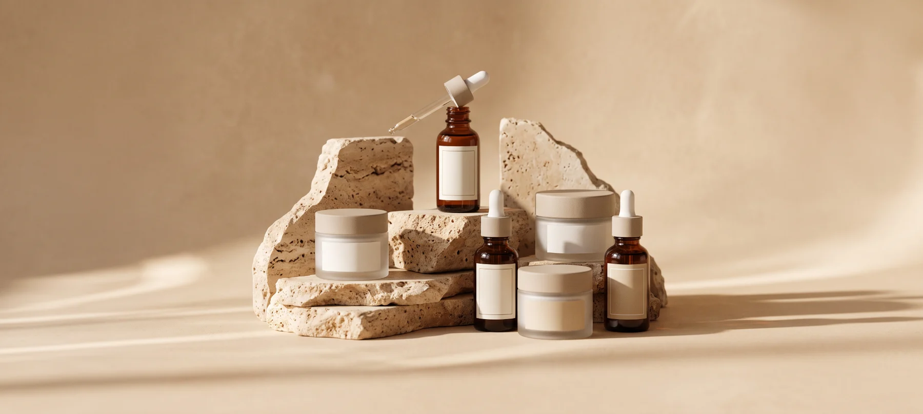
Oriel is a small-batch skincare label built on a few honest ingredients. The founders had a loyal local following but a look that disappeared next to louder, trend-driven brands on the shelf and in the feed.
Our brief was to create an identity as calm and considered as the products themselves, then roll it out across packaging, e-commerce and social in time for a national retail launch.
The category is crowded with bright colors and bold claims. Oriel needed to stand out by being quieter, which meant every detail of type, color and layout had to work harder.
The launch date was fixed by the retail partner, so strategy, design and production had to run in parallel within a four-week window.
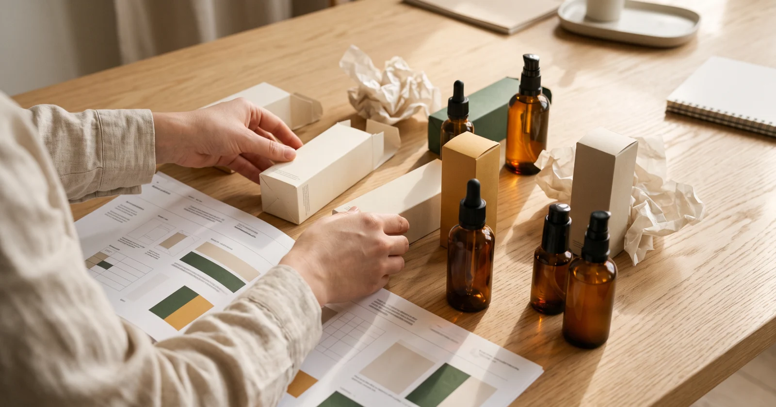
We defined a single idea, "skincare that speaks softly", and used it to judge every decision. A muted mineral palette, generous white space and a refined serif gave the brand its voice.
The identity was delivered as a complete toolkit so the in-house team could keep producing on-brand work after launch.
Oriel launched on schedule in four weeks. Return visits to the online store grew 2.1×, organic reach rose 140%, and retail buyers now point to the packaging as a reason the range sells through.
Oriel Skincare
Want results like these? Book a free strategy call and we will map the next steps for your brand.

Other brands we have helped find their voice, their look and their next stage of growth.

Tell us what you are building, and we will walk you through how we would approach it on a free 30-minute call.