Project _ 03
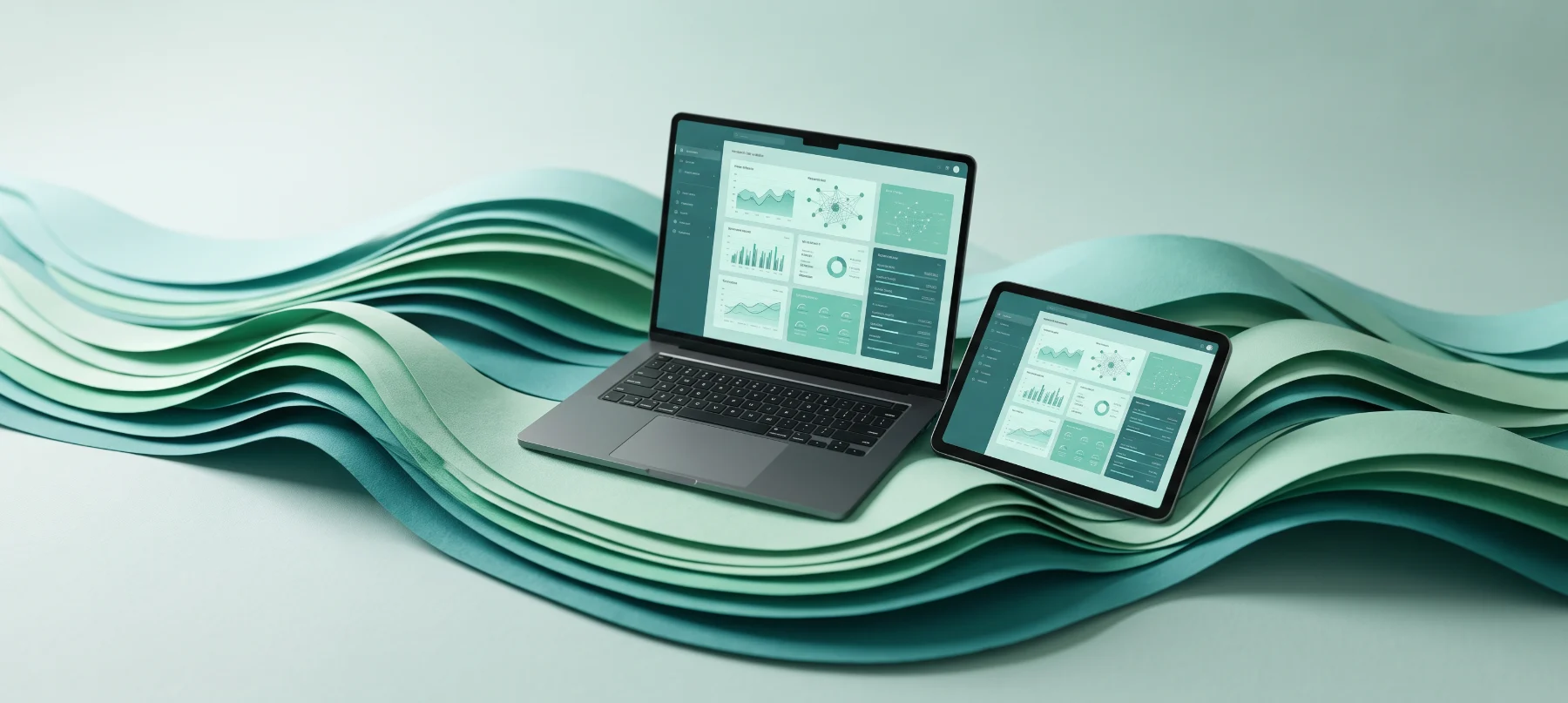
Northwind Co needed one bold visual language to replace a patchwork of campaign styles.
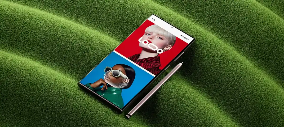
Northwind Co is an outdoor apparel company that had grown through dozens of campaigns, each made by a different agency. The result was a brand that looked different on every channel.
Our job was to create one bold visual language that could unite their stores, website, social and seasonal campaigns without losing the energy customers loved.
Northwind had years of assets and strong opinions inside the team. We needed a system flexible enough for many campaigns, yet strict enough to finally feel consistent.
The rollout also had to support in-house designers and three partner agencies, so clarity of guidance mattered as much as the design itself.
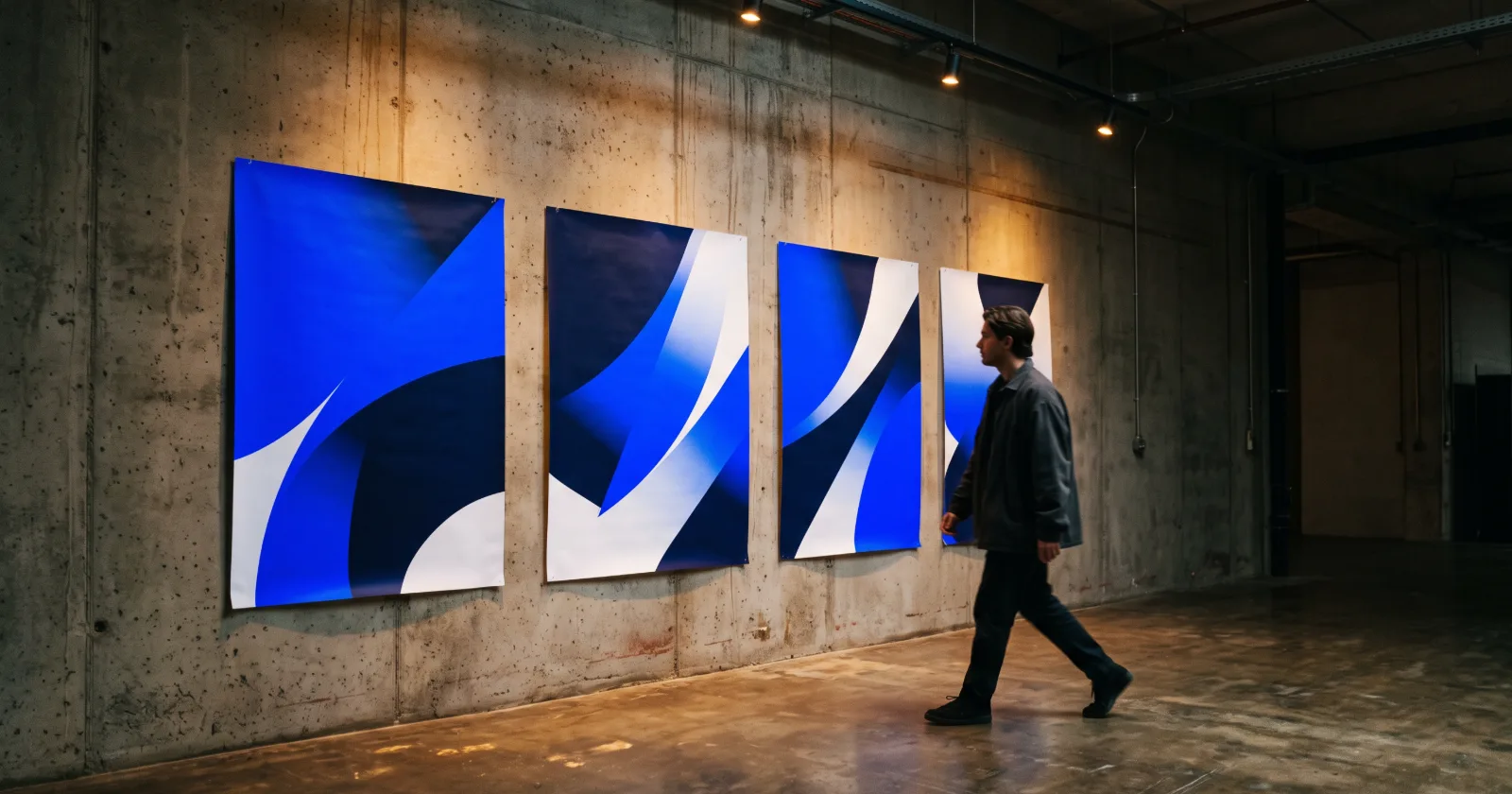
We audited every existing touchpoint, kept the elements that customers recognized and rebuilt the rest around a single graphic idea: the horizon line. It became the frame for layouts, motion and photography.
We delivered a living brand library with templates for every common format, so new campaigns start from the system rather than from scratch.
Social engagement grew 3.2× in the first season, and 92% of the internal team now use the shared templates. Northwind finally looks like one brand wherever customers meet it.
Northwind Co
Want results like these? Book a free strategy call and we will map the next steps for your brand.

Other brands we have helped find their voice, their look and their next stage of growth.

Tell us what you are building, and we will walk you through how we would approach it on a free 30-minute call.