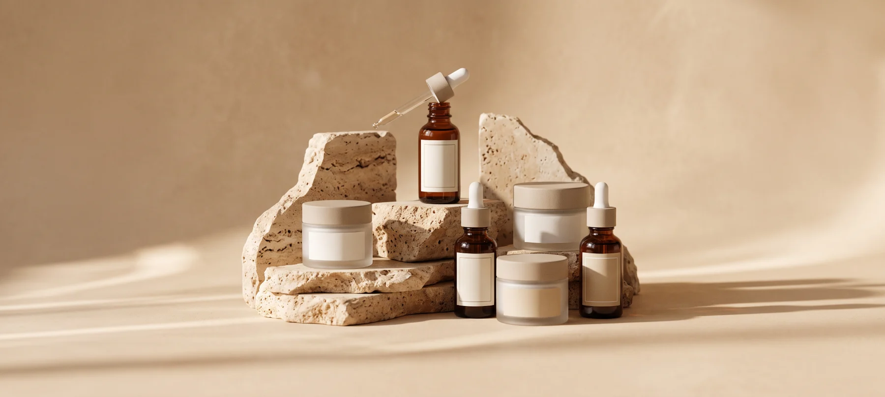
Project _ 05
Halo needed an identity bold enough to stand out on a saturated drinks shelf.
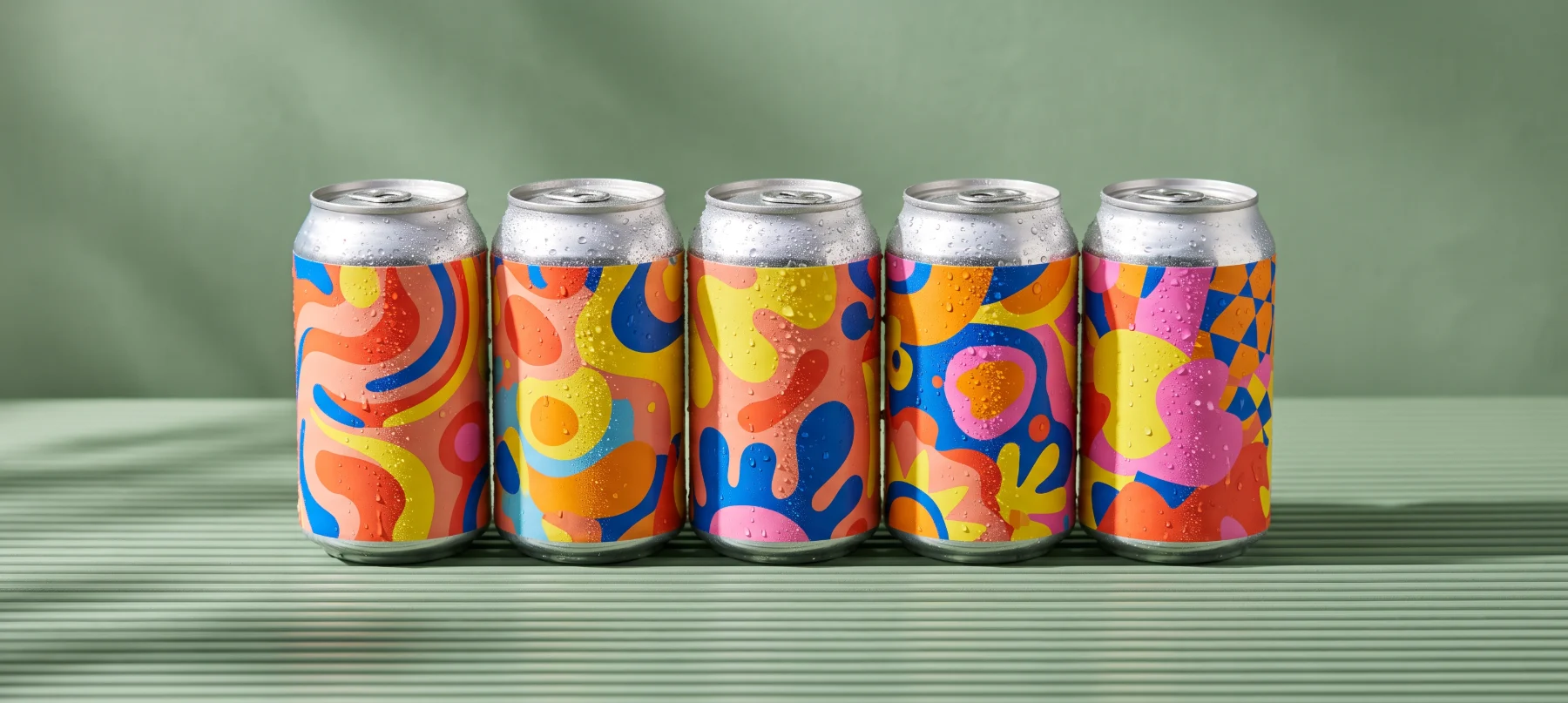
Halo makes sparkling botanical drinks in small batches. They had a great product and one local stockist, but packaging that looked homemade next to national brands.
With a regional retail deal on the table, they needed an identity, packaging range and launch campaign bold enough to win attention on a crowded shelf.
Drinks shelves are loud. Halo needed to be recognizable from three meters away, while still feeling natural and crafted rather than corporate.
Budgets were tight, so every asset had to work twice: packaging that photographs well, and campaign visuals that reuse the same system.
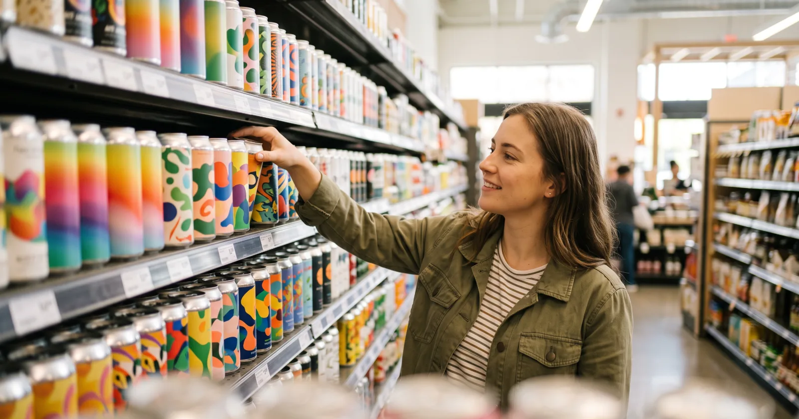
We built the brand around a glowing ring, a simple mark that works on cans, crates and screens. Each flavor got its own color and illustration, held together by a strict typographic grid.
We delivered print-ready packaging files, a launch campaign for social and out-of-home, and a lively product site with a store locator.
The first run sold out in six weeks, retailers reordered at 3.4× the expected rate, and direct traffic grew 180%. Halo is now stocked in fifty stores across the region.
Halo Drinks
Want results like these? Book a free strategy call and we will map the next steps for your brand.

Other brands we have helped find their voice, their look and their next stage of growth.

Tell us what you are building, and we will walk you through how we would approach it on a free 30-minute call.